AAC in the time of the mobile devices
With the advent of thin consumer tablets and contemporary mobile devices in general, many specialists in the domain of Augmentative and Alternative Communication (AAC) saw the their potential use for symbol-based AAC as a alternative to often clunky, expensive and restrictive dedicated AAC systems. In a relatively short period, many AAC solutions have emerged. But, with their design, some of them disregard the variations in devices screen sizes and difference in it’s users’ abilities, which can result in restriction of access instead of it’s promotion. And it’s not just the interfaces of the tablet-based AAC systems. In many cases, the symbol sets present in the application differ from the familiar symbol set the user uses. The symbol set designs also restrict access. Some symbols use images that aren’t part of the user’s culture and don’t take into account the specific requirement of the user’s language. Many of the popular symbol sets are designed way before the “mobile revolution” and don’t utilize technological advancements like high-resolution screens and support for the display of vector image formats. Also, many of the symbol sets have only one visual variant, forcing user’s with different needs and abilities to use a different set, making the communication between AAC users harder.
Although this case study is most relevant to the graphic designers, user interface designers, user experience designers and developers of symbol-based AAC systems, it could provide useful information to other stakeholders who are involved in creation and preparation of visual AAC aids.
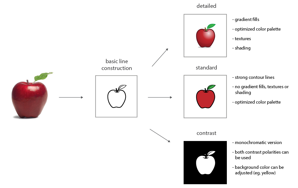
Image 1. Visual adaptations of the proposed AAC symbol system
Adaptable AAC symbols and user interfaces
Our task was to design a several AAC applications for Croatian users. Considering the needs of Croatian AAC users and stakeholders and the lack of AAC solutions on the market at the time, we have decided on developing an adaptable system of AAC symbols and GUI elements in the effort to make our AAC solutions accessible to wide range of different AAC users. Our adaptable symbol system consist of three different levels of visual complexity(standard, detailed and contrast) which are based on the same basic line construction, making the symbol adaptable to different user needs and preferences, and different means of reproduction, while retaining the recognizability. We further developed a method of visual categorization of symbol categories, which is based on the combination of shape and colour, but can be adapted to fit the user preferences.
We wanted that the graphical user interfaces supports multiple device sizes, different user abilities and preferences.
We wanted that the graphical user interfaces supports multiple device sizes, different user abilities and preferences. We have developed adaptations in layout of the GUI elements, their number and dimensions, and also the adaptations of the visual reproduction which is in accordance with the level of visual complexity, but can also support user personalization. The ability of the quick generation of prototypes and iterations during the design of the graphical user interfaces was important to discuss the solution and test them with the stakeholders. Although low and medium fidelity paper prototypes proved to be great for testing ideas and discussions within the design and development team, most of the testing and communication with the stakeholders required semi-functional or functional high-fidelity prototypes.
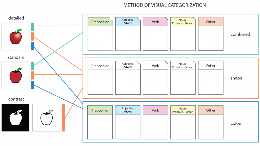
Image 2. Proposed method of symbol categorization using frame shapes and colours
Resources
During our research, design, development and testing of adaptable and adaptive symbol-based AAC interactive systems, we have established a set of guidelines which might be useful to creators of such AAC solutions and assets in improving usability and accessibility of such systems. We have separated the guidelines for designing graphical symbols.
AAC symbol design guidelines:
- In symbol systems for AAC, it is desirable to use representations of those objects that are characteristic of the user’s environment and culture.
- The technological characteristics of symbol files for AAC should support the possibility of implementation within the Visual Scene Displays (eg. symbols should have version with transparent background)
- For multicolored and multi-shade AAC symbols it is necessary to clearly indicate the contours of the displayed figures by using lines with enough contrast
- Lines should be clearly defined when the symbol is reproduced in its smallest print size or displayed on the screen in the lowest planned resolution.
- For the consistency of visual representation, it is necessary to define a limited amount of different line thicknesses to be used for the line construction in the entire set of characters.
- When outlining objects on the symbol it is recommended to use a constant line thickness throughout, except for the extremities.
- Because of visual adaptation of AAC symbols, textures that are essential for recognizing meaning of the symbol should be indicated by lines.
- In the standard and contrast symbol adaptations, visual texture is used only if its use promotes recognition of the symbol/representation.
- In regard of level of symbol iconicity, always tend to use depictions which are highly transparent.
- For faster and more accurate recognition, it is advisable to display objects, subjects, and scenes in their canonical positions (from the point of view where their most prominent features are clearly visible).
- Monochrome representation of graphic characters should be offered for both contrast polarity (positive and negative monochrome versions).
- The contrast ratio between the image elements and the background of the sign should be 4.5: 1, calculated according to the WCAG guidelines, preferably 7: 1 for the contrast version of the symbols.
- Recognition and understanding of the symbols can be increased by animating the symbol.
- The technical execution of the symbol should support reproduction on a broad spectrum of print and digital media.
- To keep the sharpness of displaying symbols independently of their screen dimensions, they need to be generated using vector graphics and stored in a vector graphic file format
- The format of documents used to store graphic characters should be supported in all operating systems where the characters will be used.
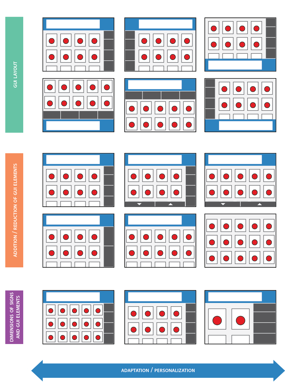
Image 3. Spatial adaptations of the symbol-based GUI
Guideliness for the design of adaptive and adaptable Graphical user interfaces (GUI) for symbol-based AAC:
- Users need to have easy preparation, storage and access to pre-formulated messages.
- The design of GUI should be aimed at reducing the cognitive and motor loads of the user.
- The design of the GUI should be accessible and usable to users with a broad range of perceptive, cognitive and motor skills.
- GUI should also enable easy access to secondary users: to parents and caregivers of AAC users, speech and language therapists and other stakeholders in AAC communication process.
- The layout of symbols and commands within GUI should be adapted to the specifics of the language in which the user is communication.
- Easy implementation of user generated symbols should be enabled.
- For children, AAC users, in the early developmental age, it is advisable visualize the vocabulary through Visual scene displays
- Users should be provided with control of automatic system adaptations.
- Accessing GUI segments that are not intended for primary users, such as advanced application settings, should be limited by requiring timing or motor-specific precision actions to avoid accidental activation
- Moderate use of adaptive elements is recommended, especially for the spatial/layout adjustments of GUI elements. Particularly important is to avoid significant and frequent changes to the layout and positioning of toolbars and commands.
- It is recommended to initiate the process of personalization of the graphical user interface during the first launch of the application or service.
- It is recommended that the system actively monitors user performance and suggests more appropriate GUI settings on the basis of reported errors.
- Contrast ratio between text labels and background should be 4.5: 1, calculated according to WCAG guidelines, preferably 7: 1 for the contrasting degree of visual adjustment.
- If the GUI commands are presented as visual metaphors, they should be from a known environment to the user.
- It is necessary to clearly and unambiguously visualize what user interface elements the user can or may not interact with at the given time, and what interaction results can be expected.
- Moving through different symbol grids/boards and hierarchical structure of vocabulary needs to be accompanied by animation.
- Adaptations within GUI need to be accompanied by animation.
- Instead of color, highlighting a symbol selection should be performed by animating the size of the symbol (enlargement).
- Using animation in AAC interfaces should be moderate. It is not recommended to use more than one animated element at the same time, except for highlighting the correlation or when it comes to group modification of the elements on the screen.
- Commands or functional interaction elements intended for the AAC users shouldn’t be dependent solely on the text description.
- It is not recommended to use a cursive letters to display text elements in the user interface of the AAC service.
- The emphasis on textual elements in interfaces with visual adaptations should be made by contrast in the thickness or the size of the character, with the possibility of combining with emphasis by using colour.
- It is desirable to use devices whose resolution exceeds 286 ppi or angle resolution of the human eye at the normal viewing distance from the device.
- Adequate dimensions of the reproduction of symbols and all functional elements of the user interface should be provided with regard to the differences in dimensions and screen resolution on mobile devices.
- The minimum dimensions of active elements within a AAC user interface should form a 1×1 cm square on the screen of the device on which the interface is to be used. It is necessary to include the ability to change the size of the active elements to allow unobstructed access to motor impairment users.
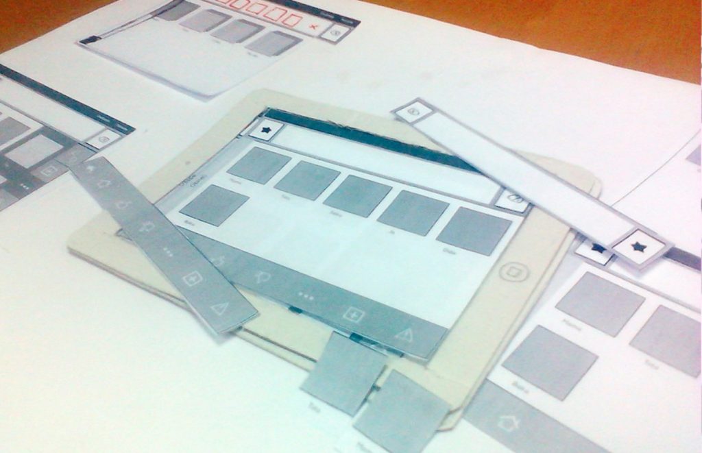
Image 4. Early design prototype of Komunikator+ app, made from paper and cardboard
In regard of the tools to design symbols using vector graphics, although we have used Adobe Illustrator CC, which is considered one of the most widely used tools by professionals, there are more affordable solutions, such as Affinity designer, Sketch, or Inkscape, which is free.
As for the design of the graphical user interface, it can be done in any of the aforementioned programs, but there are more specialized solutions, like Sketch, Figma and Adobe XD. Some of solutions, like Invision, enable simulating some of the functionalities without coding, which enables the design team to quickly setup and perform usability tests with the users.
Komunikator+ app
Although the symbol set is still in development, many of our guidelines for designing GUI for AAC are applied on the design of the “ICT AAC Komunikator+” app, which is available from the App store for free.
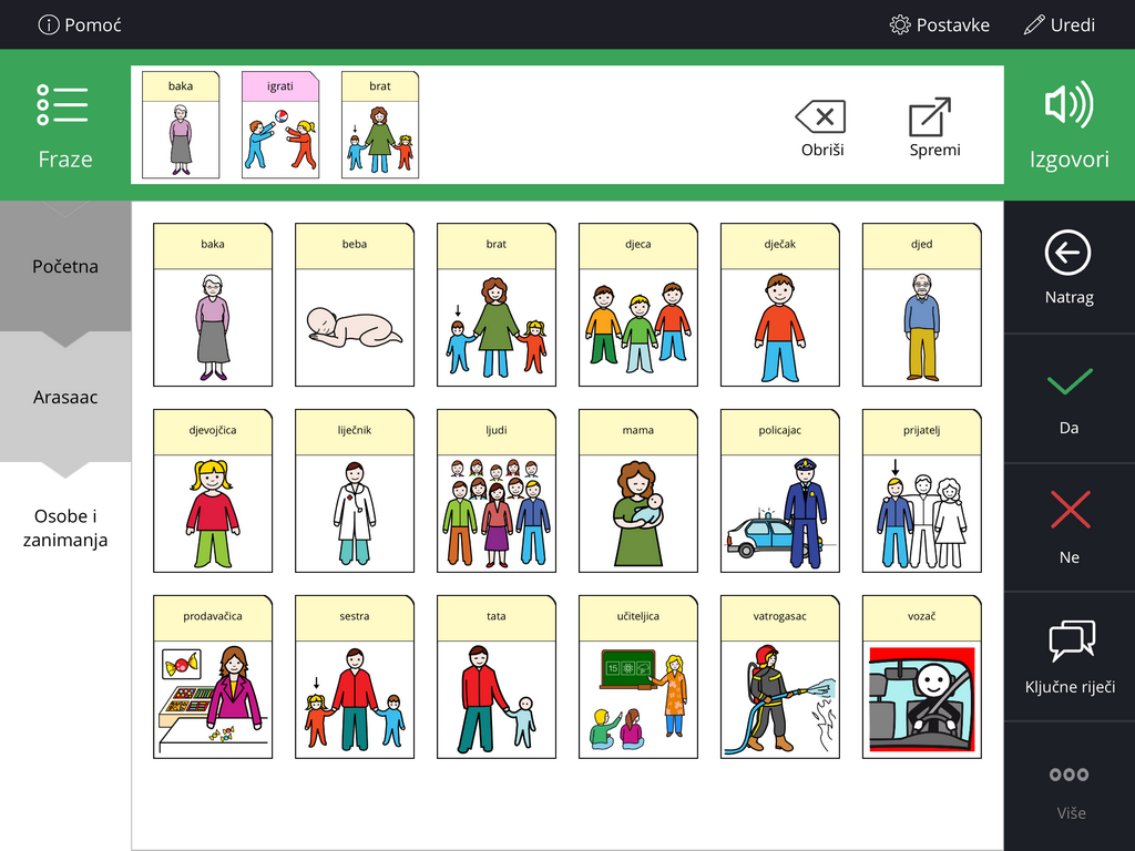
Komunikator+ app interface
“The European Commission support for the production of this publication does not constitute an endorsement of the contents which reflects the views only of the authors, and the Commission cannot be held responsible for any use which may be made of the information contained therein.”
Did You like the artice?
 4
4
Jurica Dolic
University of Zagreb, Faculty of Graphic Arts